Brand Identity / Digital

Autosana (YC'25)

Overview

Led a brand identity refinement for Autosana, a YC backed startup using AI agents to automate end to end testing across mobile and web applications. Redesigned the primary logo and expanded the typography system to create a more cohesive and recognizable identity while preserving the brand's existing visual foundation.

Implementation in progress.
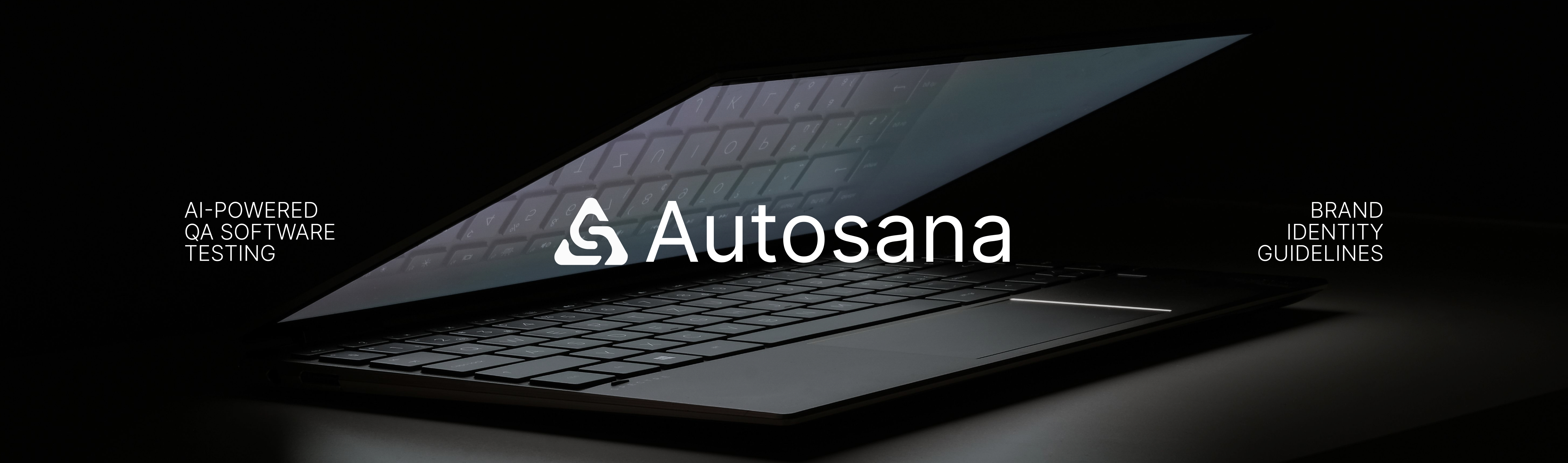
Autosana brand identity guidelines cover — logo over a half-open laptop, AI-powered QA software testing
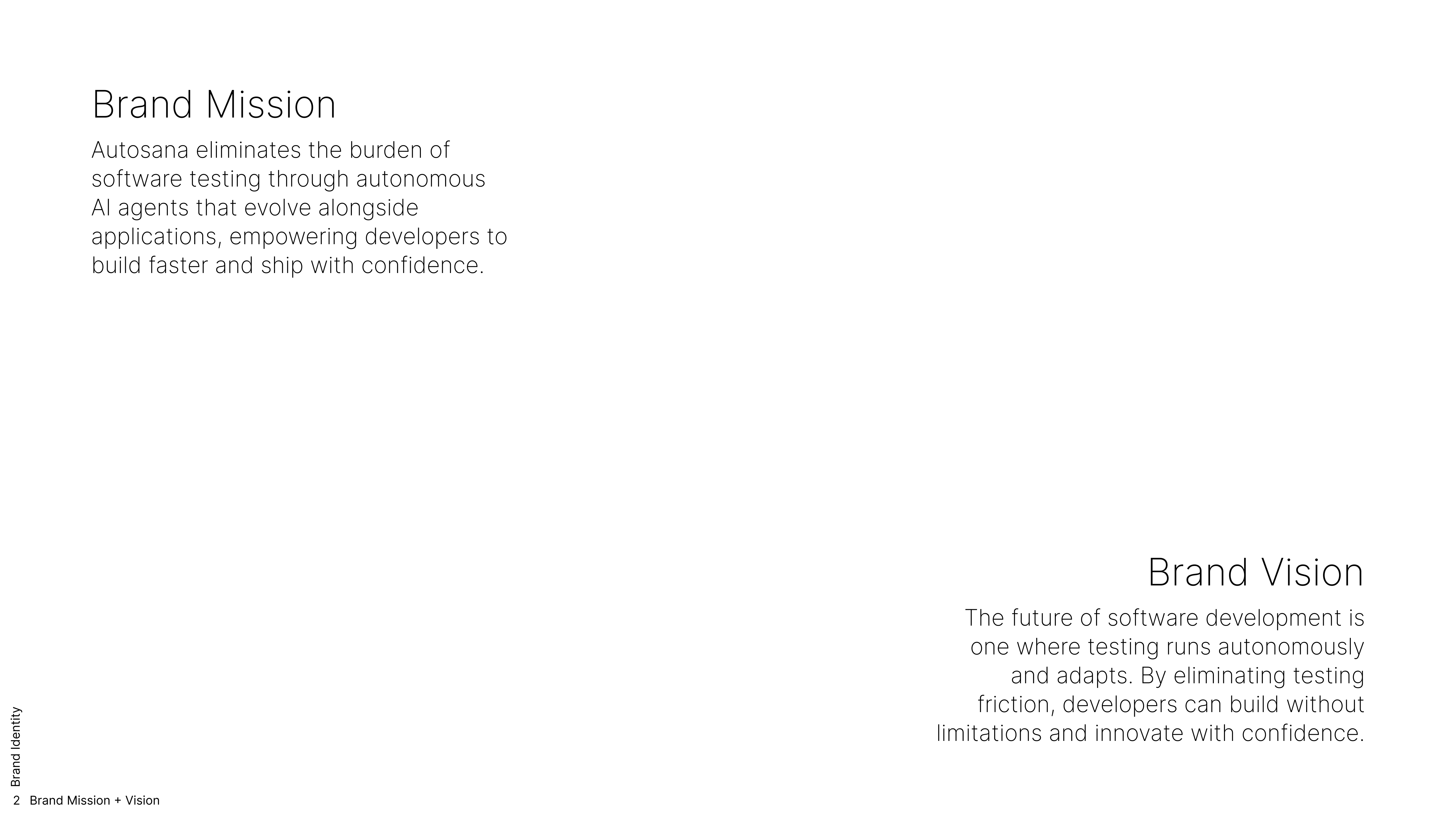
Autosana brand mission and vision
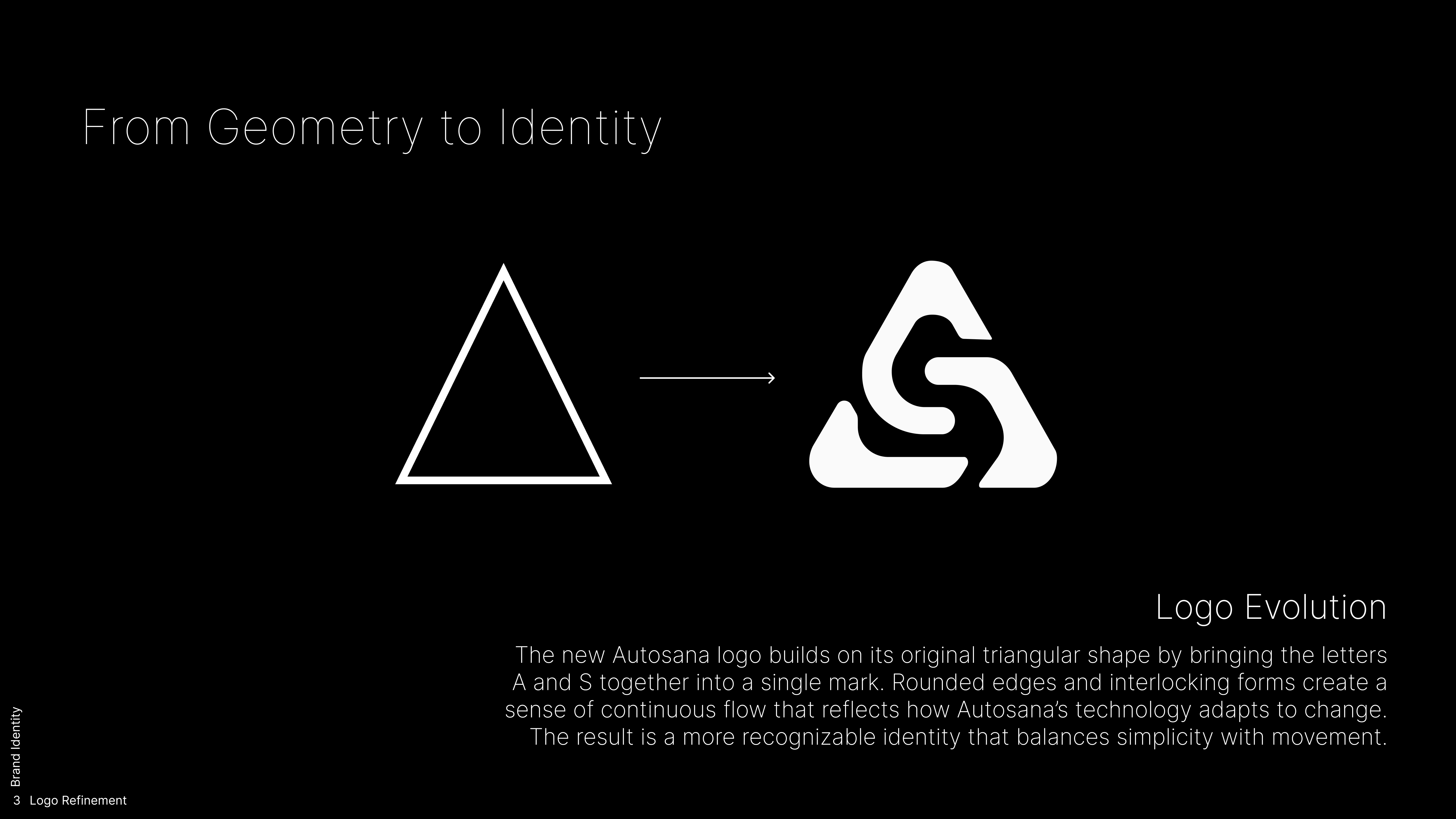
Autosana logo evolution from a triangle outline to an interlocking A and S mark
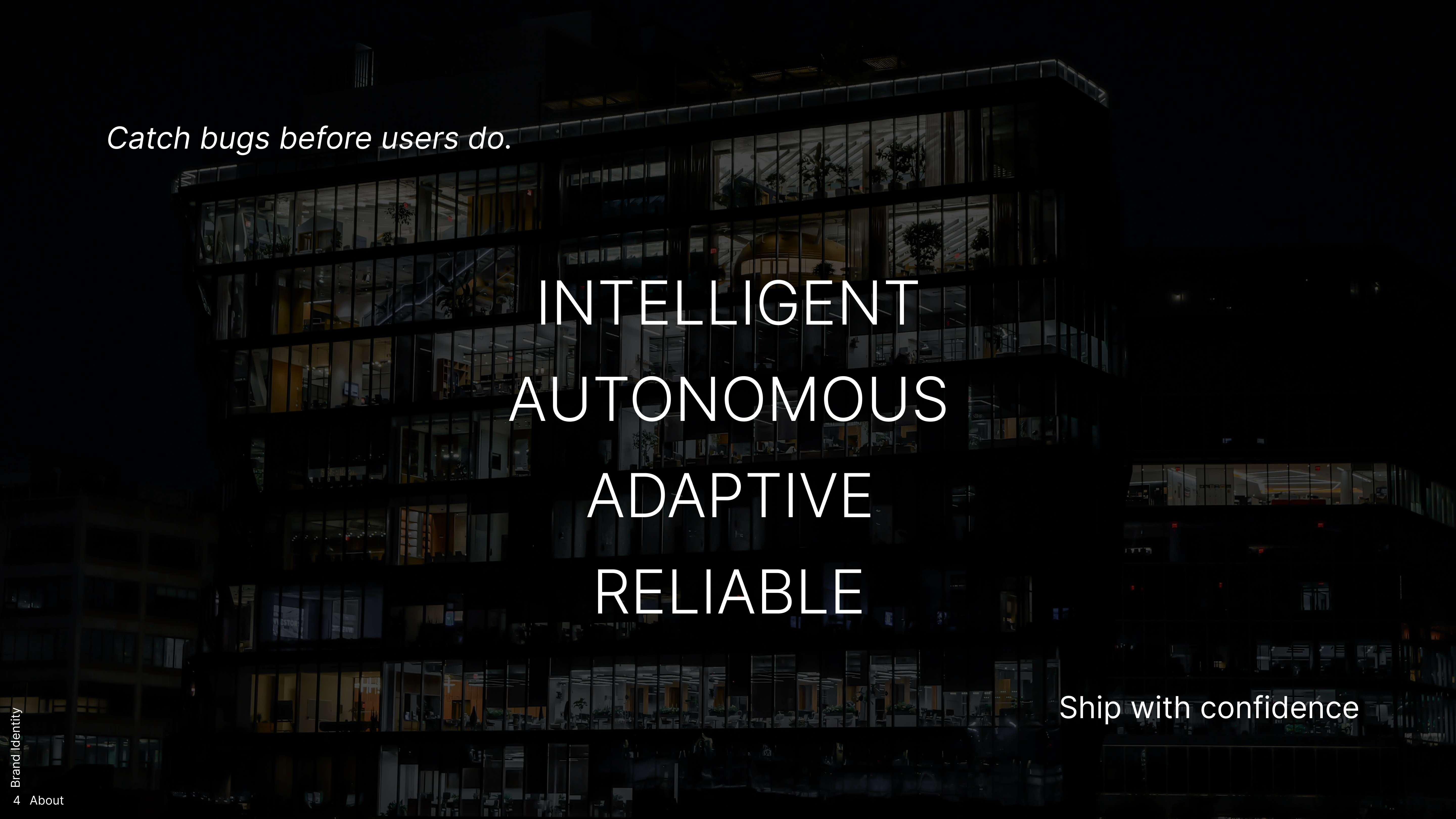
Autosana brand attributes — Intelligent, Autonomous, Adaptive, Reliable — over an office building at night
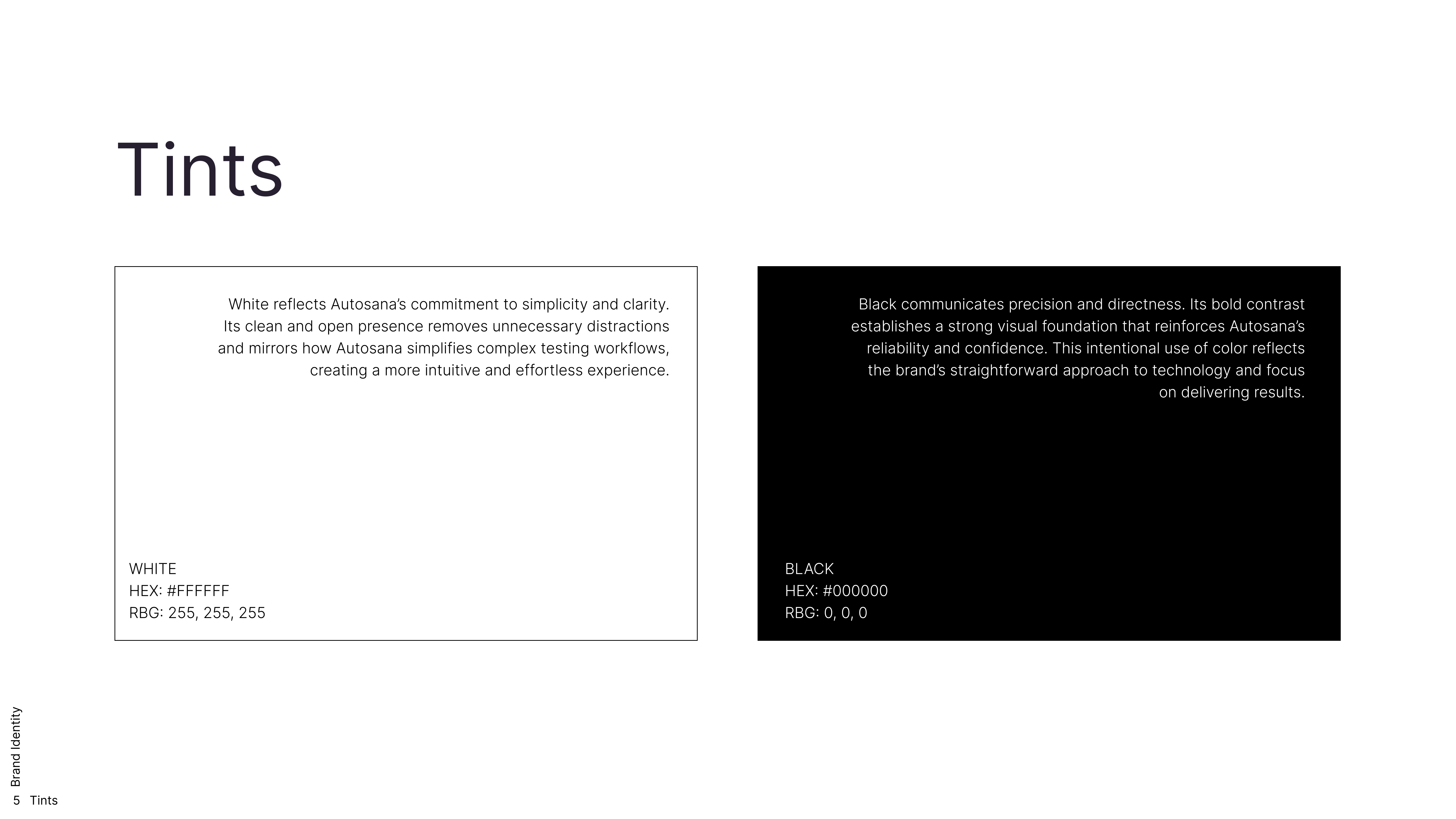
Autosana color tints — white and black
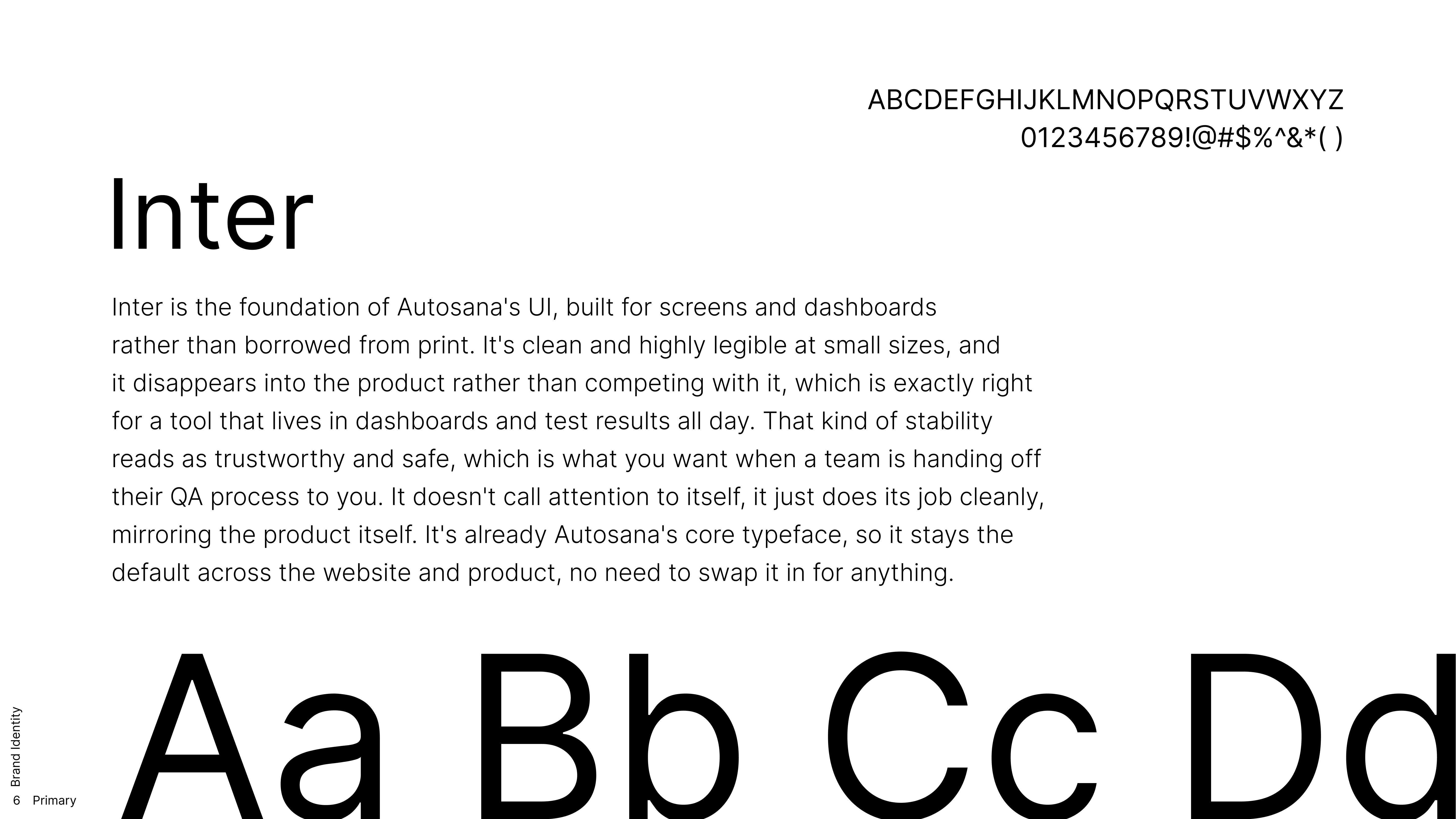
Inter primary typeface specimen
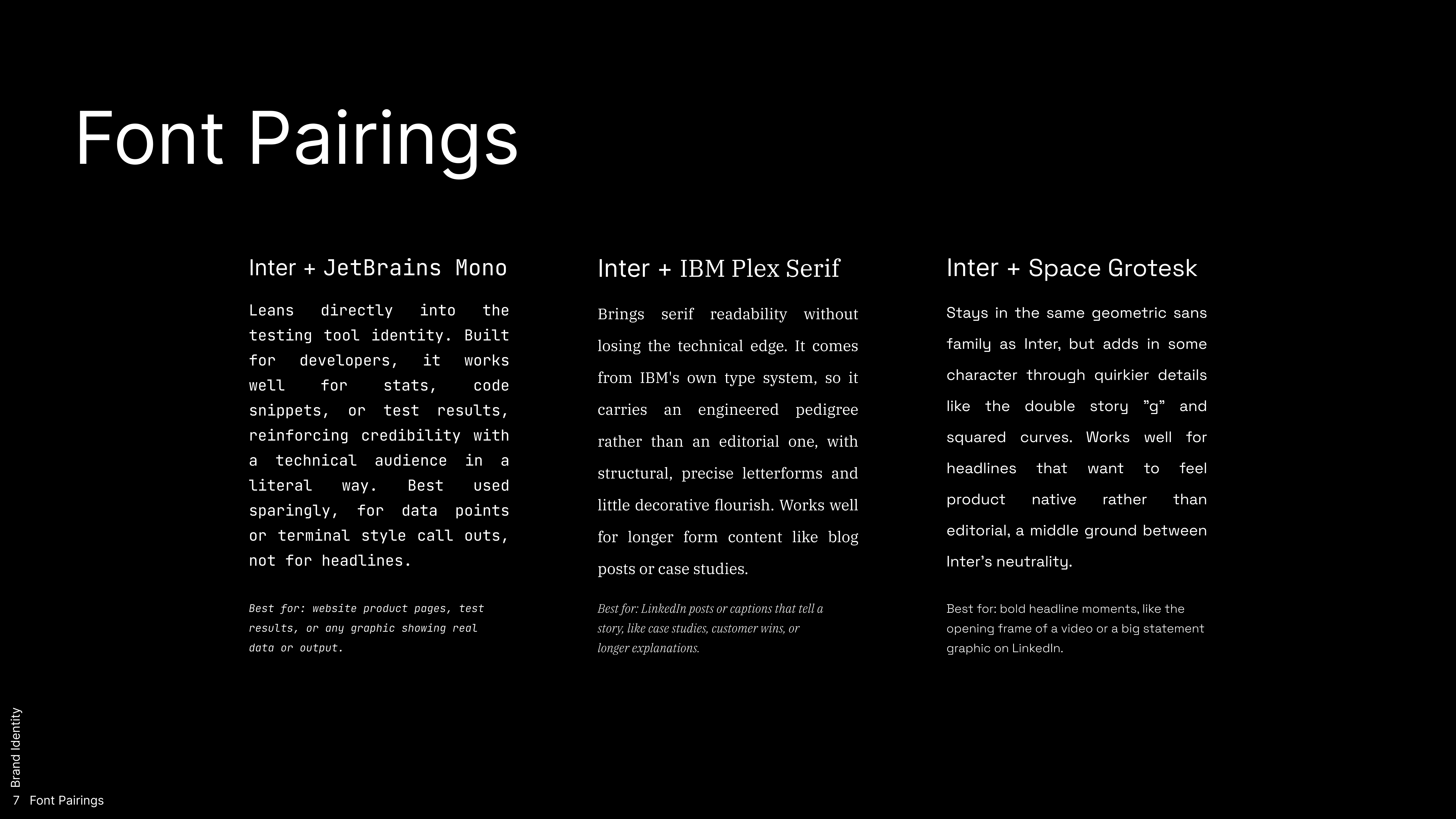
Autosana font pairings — Inter with JetBrains Mono, IBM Plex Serif, and Space Grotesk
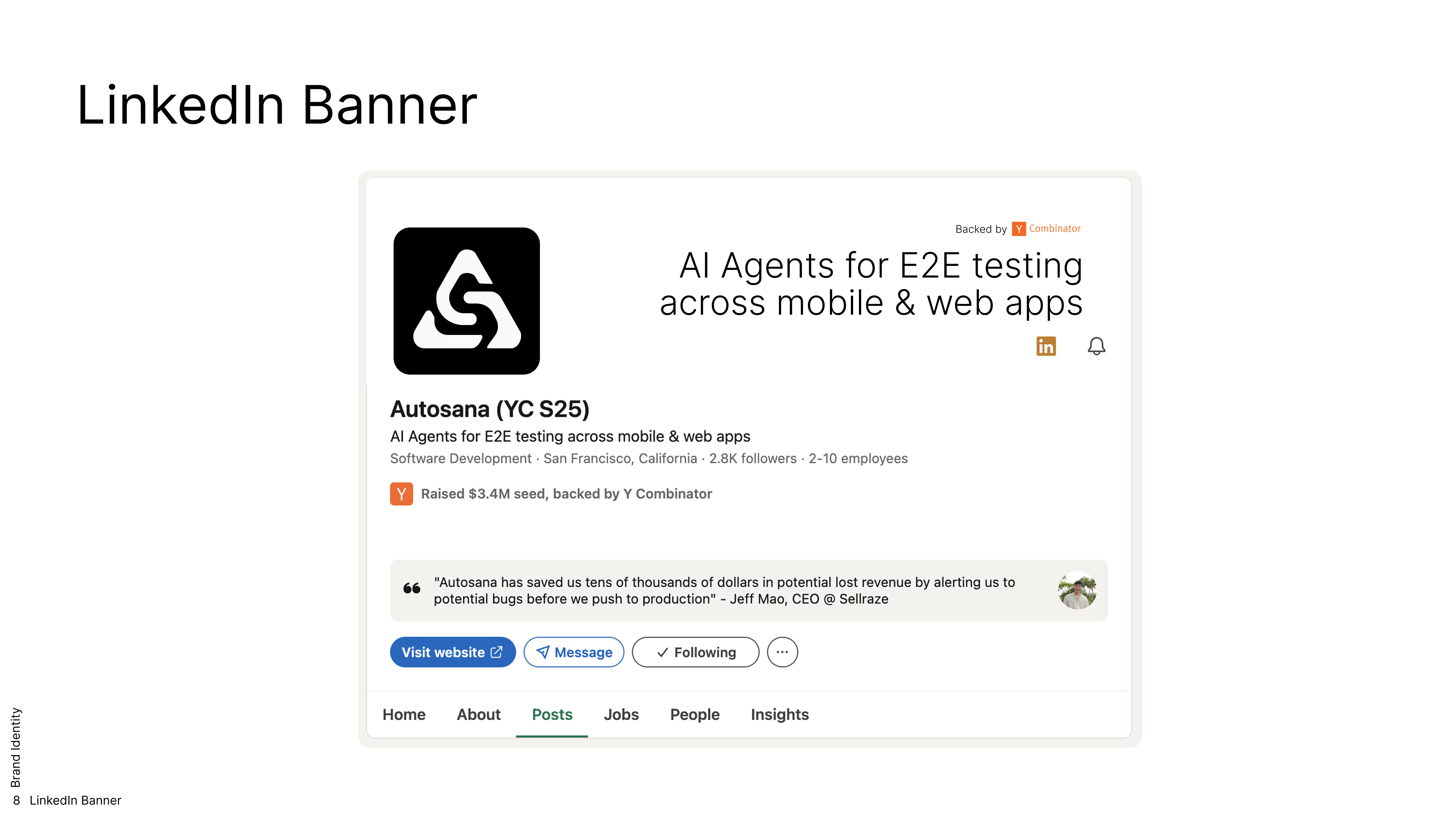
Autosana LinkedIn banner and company page
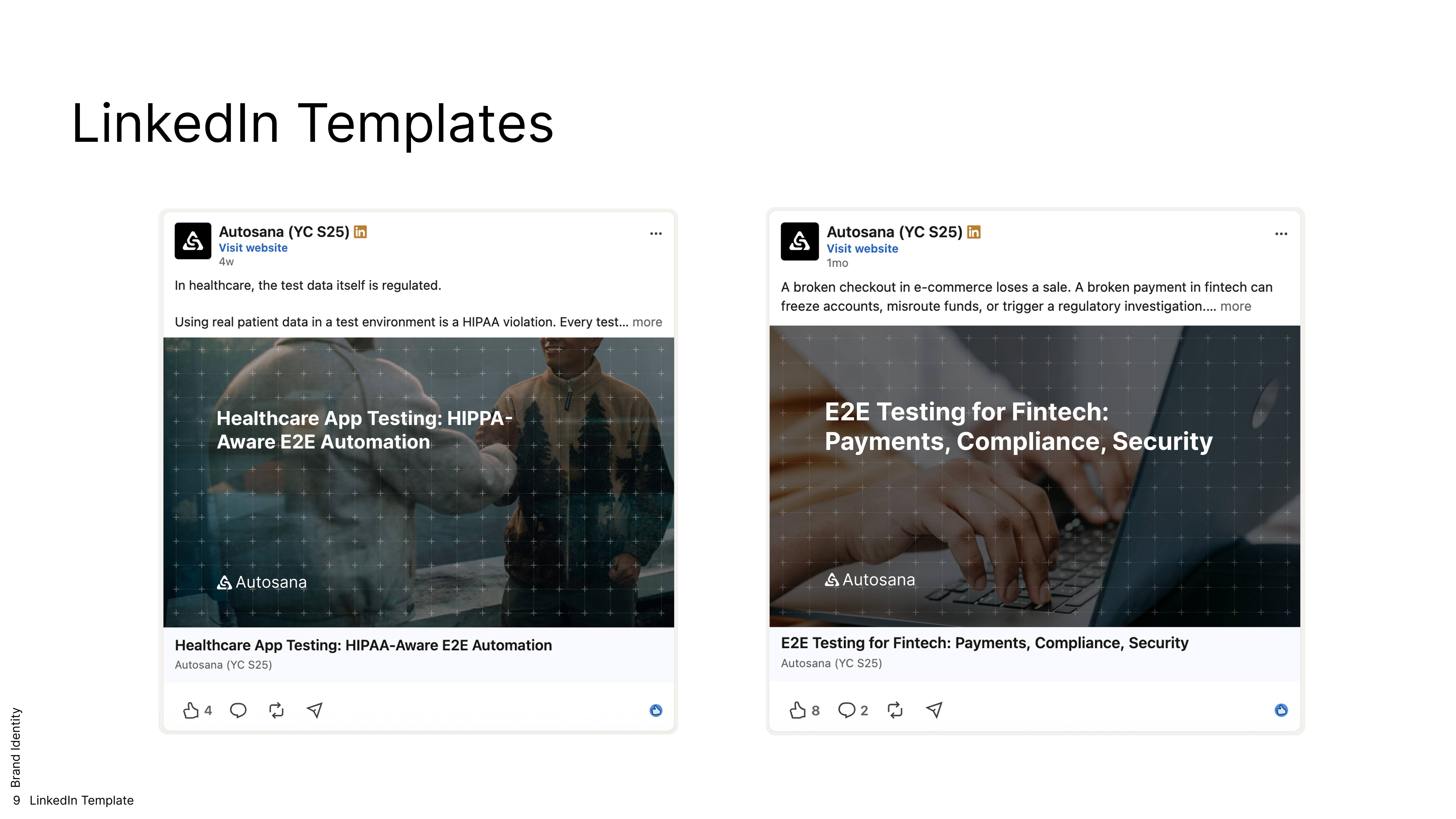
Autosana LinkedIn post templates for healthcare and fintech testing
Autosana campaign graphic — Write the flow once. We'll handle the rest.

Client Autosana (YC S25) Role Brand Identity, Logo Refinement, Typography Typefaces Inter, JetBrains Mono, IBM Plex Serif, Space Grotesk Year 2026